How To Think About Prints in Swimwear
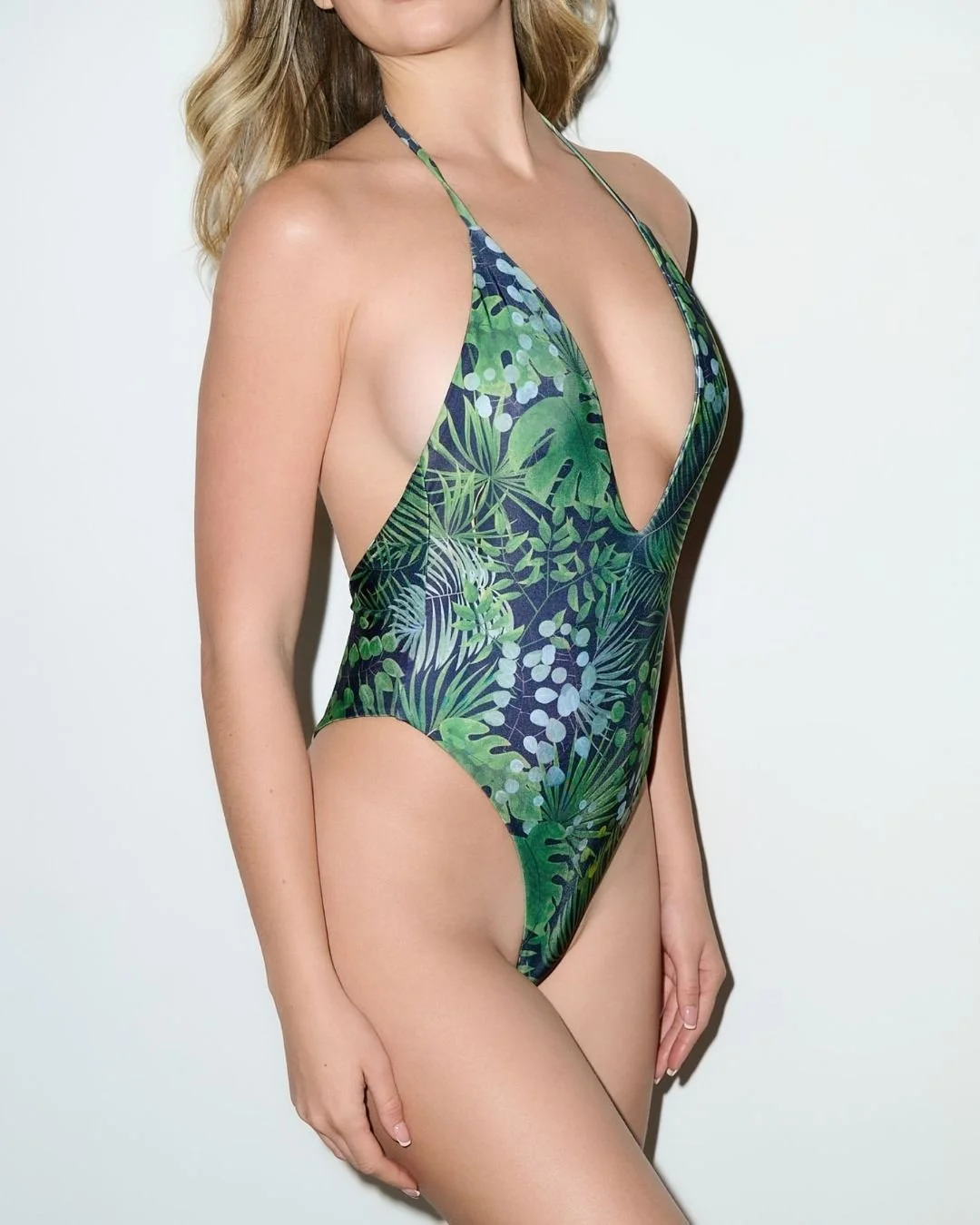
Print is one of the first things people notice in swimwear, but I do not think enough people talk about what actually makes a print feel good. A print can be bold without feeling loud. It can be eye-catching without feeling costume-like. And it can still be wearable even when it makes a statement.
That balance is what interests me most.
I have always thought a good print should do more than just add color or surface interest. It should shape the mood of the piece. It should help define whether something feels sharp, relaxed, playful, graphic, or elevated. In swimwear especially, where the garment itself is often minimal, the print carries a lot of weight.
That is also why I think a lot of swim prints miss the mark. Sometimes they are too busy. Sometimes they rely on novelty. Sometimes they feel overly sweet or overly trend-driven in a way that dates them quickly. And sometimes the issue is not even the print itself, but the scale. A print can be beautiful in theory and still feel wrong once it is placed on the body.
Scale matters more than people think. A smaller, denser print can feel fussy if the silhouette is already minimal. A larger print can feel stronger and cleaner, but only if the proportions are right. Placement matters too. The same print can feel completely different depending on how it moves across a bikini top, a high-waist bottom, or a one-piece.
For me, the best swimwear prints are the ones that feel intentional from a distance and interesting up close. They should not need a long explanation to justify themselves. They should feel immediate. At the same time, they should have enough depth that they do not become flat or forgettable after one season.
I also think a print has to work with the silhouette, not compete with it. If the style itself is minimal, the print can carry more energy. If the silhouette is already doing more — through ruching, cut, or shape — the print often needs a little more restraint. The strongest result comes when the two are balanced.
This is one of the reasons I tend to prefer prints that feel directional but still grounded. I like a print to have personality, but I do not want it to overwhelm the wearer. Swimwear should still feel flattering and easy to wear. A strong print should enhance that, not fight it.
Animal prints are a good example. When done well, they never really go away because they already carry a certain confidence. But even there, the difference between a good animal print and a bad one is enormous. Tone, spacing, scale, and color all matter. The same is true for florals, abstracts, and geometric prints. What separates the elevated versions from the forgettable ones is almost always control.
I think that is why I care so much about print direction in swimwear. Because once you strip swimwear back to its essentials, there is very little room to hide. Fabric, silhouette, and print all become more visible. That is what makes a good print feel powerful. It is not decoration. It is part of the design.
When I think about PLAYALUXE, print is one of the places where the brand point of view becomes clearest. I never wanted the prints to feel random or overly trend-dependent. I wanted them to feel like part of a full visual language — bold, yes, but still considered. Strong enough to be memorable, but refined enough to keep wearing.
For me, that is the goal. Not to create prints that only work in one moment, but prints that still feel exciting because they are grounded in something stronger than trend alone.
That is how I think about prints in swimwear. Not as an extra feature, but as one of the details that most clearly determines whether a piece feels elevated or not.